
Pro Tips for Capturing Screenshots
Take your technical writing to the next level by presenting screenshots in the most effective way.
Visuals are an essential part of documentation. They aid the written text by providing additional context to help reduce the overall amount of text that it takes to explain an idea or instruction. And documentation visuals are very often screenshots.
In many cases, it's trivial to capture a screenshot. But the resulting image isn't a one-to-one replacement for what you see on your screen when you're making the capture. For example, you can take a screenshot of an editor full of code. But readers are likely not looking at the image at the scale of your machine, which can make the code impossible to read and the screenshot meaningless.
Here are a handful of pro tips to consider while capturing screenshots for the content you are creating. These tips are designed to make the editing process easier, thus boosting your productivity by limiting the amount of time you need to spend beautifying the image after capturing it.
Capture with Empathy and Realism
You want to capture what your readers are actually going to see. Avoid presenting scenarios that users are unlikely to encounter.
For example, if you're taking a screenshot of an application you are developing, you likely have views that other users can't see. Capturing these won't help the reader. Instead, mimic the user. Show their view. And use realistic data/content over placeholders.
Use Application Defaults
To aid with realism, avoid introducing a lot of customizations to what is seen on screen.
For example, if capturing within a browser, either omit the window around the browser or use a "profile" that doesn't have plugins, extensions, custom theming, etc. All of these will be distracting and take away from what you're looking to communicate.
Take the image below. There are a handful of tabs open, and extensions enabled. None of this helps the user and instead limits the area of focus on the screen.

One way to improve the image is to use a similar view, but with only the application's default settings.
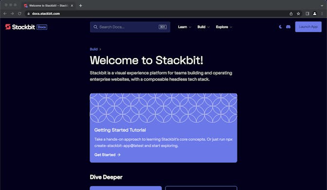
Another way is to remove the application frame entirely and just show what is inside the viewport.
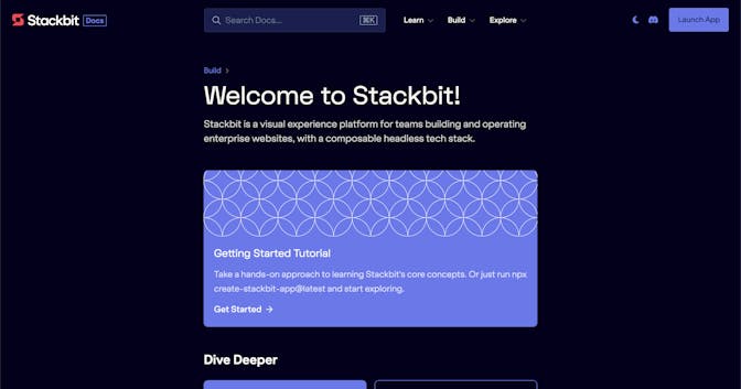
You can further aid this by building a visual frame with code. Here's an example that stylistically mimics a browser window.

Remove Distractions
Similar to using defaults, be sure to remove other distractions that don't help the user.
For example, if showing your desktop, you don't want to see icons.
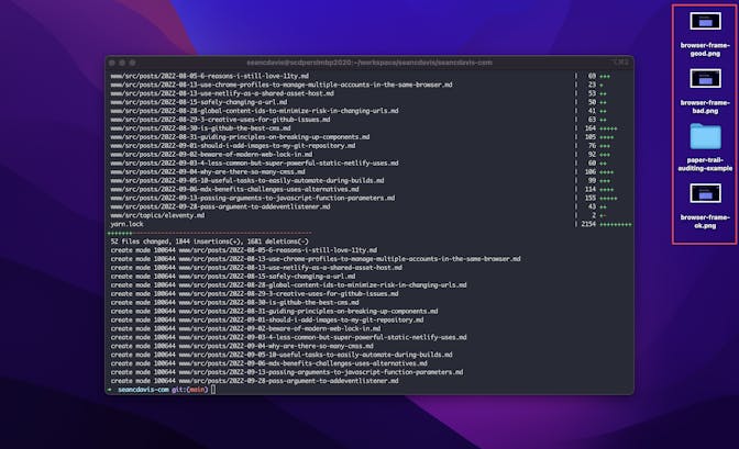
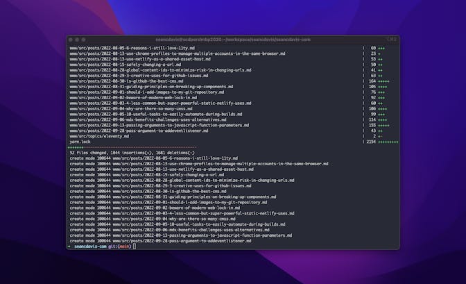
Either clean them up, crop them out, or use software (like CleanShot X) that automatically removes them.
Zoom In and/or Focus on What Matters
You can certainly crop, zoom, rotate, and scale later, but it's easier if you don't have to. Present the information in the best possible way when capturing. Only show the user what they need to get the context.
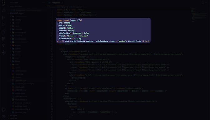
For example, if you are going to take a screenshot of some code (which you probably shouldn't — just use text), don't show the whole application. It will take readers a long time to figure out where they should be focusing their attention.

Instead, you can focus on one specific area — the part that really matters.

You could also choose to highlight to draw attention.

But, know that highlighting is not enough when the details still get lost among other distractions.
Balance Padding
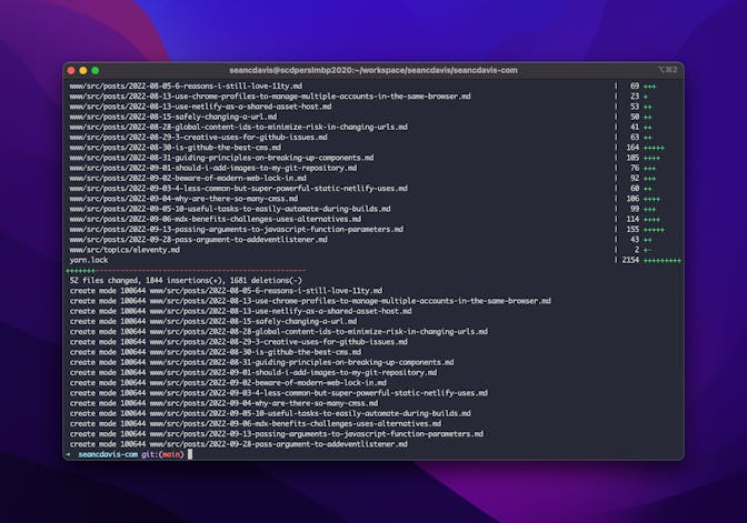
Balance your whitespace and padding as much as possible when capturing. You don't have to obsess over it, but it's also best to not have to rely on cropping within these annotation tools, as it may not be flexible enough to capture exactly what you need. But when capturing, you can control the boundaries down to the pixel. (Although you can choose to be stylistic)
It's one thing if you're intentionally stylizing your screenshots. If not, don't take screenshots so quickly that you end up with uneven edges.
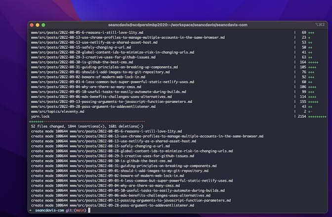
Try to balance the borders and padding. This also helps the reader focus.
Use an Application
It's great that Mac OS X comes with native screenshot controls. But you also aren't tied to using these. There are other tools like CleanShot X and Shottr. They also make annotating and saving the screenshots a more trivial process.
Combine these tips together to take your screenshots to the next level and help your readers consume your content more quickly.


