Organizing Documentation by User Mode
We rebuilt the Stackbit documentation site from scratch, reorganizing everything by expanding on the Divio documentation system.
Organizing and maintaining Stackbit's documentation is a challenging process. Aside from the typical rapid feature development that many startups undergo, Stackbit is extremely flexible/configurable, but not well understood.
We have to provide practical examples and guides so developers know what's possible. But we also have to be sure to document the capabilities of Stackbit so that developers can solve problems on their own once they get started.
In these early days, our docs are growing rapidly. We're still learning exactly how to write and teach about our product.
And so when we set out to bring our docs site up to date both visually and technologically, we took a step back to consider how the content should be organized.
Organization Matters in Documentation
I've often feel like I'm overthinking the documentation organization. But I've found that exercise to be extremely valuable, especially in the early days of a product.
This is because there are really only two things that matter with documentation in the early days:
- The information users need exists, and ...
- Users can find that information.
There are a number of ways to help users find what they are looking for, but the underlying importance is in how the content is organized and presented to the user.
Working with the Divio System
The documentation site I inherited from Stackbit followed the Divio system for organizing content. And it worked great!
Brief Introduction to Divio's Documentation System

Although you can read much deeper on the subject, the Divio system essentially organizes content into four types: tutorials, how-to guides, explanation (I prefer "concepts"), and reference material.
Benefits of Divio Documentation
The major benefit I extracted from this approach was that every piece of documentation had a specific focus. If I wanted to share information, I'd have to think about the problem I was solving for the user, and then write the content accordingly.
And in theory, if a user could find the right piece of documentation, it would be catered to solving their specific need. They could get in, get what they needed, and get out quickly.
Example of Divio Documentation
The Gatsby docs are a great example of a tool that has grown to a large scale but has been able to maintain the rigid structure of this system.

Challenges with Divio Documentation
As great as it is in theory, I've felt a lot of friction in trying to adhere to this system. The more I've reflected on this, the more I've come to feel that it has to do with a lack of definition in the how-to guides section.
The other three types of docs — tutorials, concepts, and references — are each finite and obvious. It's obvious when something isn't where it should be in one of those sections. And those sections will only grow as your core product offering grows.
Guides are infinite. They can serve any use case, feature, problem, integration, persona, etc.
It makes sense that the system doesn't try to solve this problem, as it is contextual to the thing that is being documented. It's simply that this is where the challenge sets in.
Building on Divio's System
After more than a year of organizing and reorganizing how-to guides, and after launching a new documentation website, we've made two major adjustments to the Divio system:
- How-to guides are broken up into several categories
- A new "reader mode" brings to light an overlooked Divio feature
Further Structuring to How-To Guides
Long before we launched the site, we were feeling the friction of how-to guides becoming a dumping ground that no one could reasonably navigate beyond searching directly for some content. That meant we had a problem.
Over time, we split off various subtypes of documents that you could argue all fit under the "how-to guides" umbrella. Today, these are the types of how-to guides we have:
- Developer Guides: Procedural guides focused on solving a technical problem. We sometimes consider these use-case guides.
- Features: Generic technical overviews for specific features that can't be covered in a single use case. They are typically written as how-to work with some specific feature.
- Integrations: Although mostly unavoidable, we try to keep information about third-party tools out of the rest of our documentation. Instead, they go into this section, categorized by vendor, and further broken up as needed.
- Troubleshooting & FAQ: Usually short answers to very specific questions or problems, which we don't want to detract from the how-to guides we want to highlight.
- Editor Guides: The non-technical side of developer guides. These are about working with the product but for the end user (we call them "editors"), not the developers. In many sites, these end up in a different place altogether, but we're keeping them close for now.
What I love about where we are today is that it further defines where we place content, forcing us to be more mindful when introducing new content. It also helps separate not just what we're writing about, but who we're writing for. 95% (or more) of our documentation is for technical users, but we still want the end users to be able to find what they are looking for quickly.
Introducing "Reader Mode" for Documentation Navigation
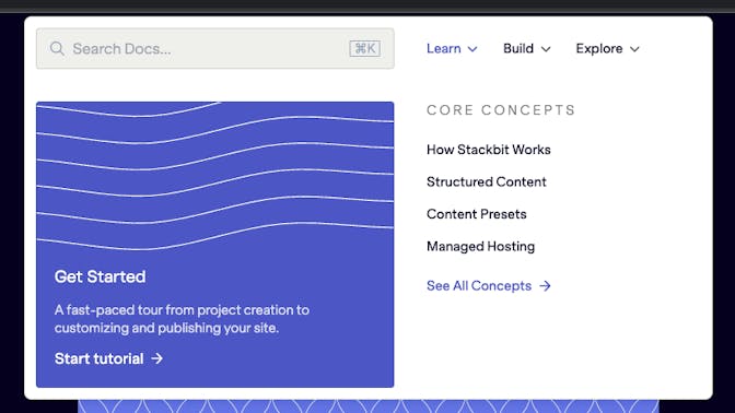
The other change we made was introducing a "reader mode" that is meant to build on a core Divio attribute that I had overlooked — where the user is in their journey.
Divio breaks this down into two categories: studying and working. After reflecting on that, I think there's a third category in which users may be exploring, or looking to find what's possible with the product. (There may be more nuance here than necessary, but time will tell.)
In the end, we chose three reader modes: Learn, Build, and Explore. And this is how we present the content immediately and globally in the main navigation.

We still maintain the other types of guides, but they become contextual based on where the user is in their journey.

Empathetically Iterating and Adjusting
As I write this, we've only been live for a couple weeks. There is still much to learn, build, and explore (😉) with this approach. We'll continue to study traffic and have conversations with our users to better refine this approach.
While I'm doubtful that we've struck gold, I do think we've identified the main friction points in trying to stick with Divio in an expanding environment. And the approach we've taken today feels like it balances writing conveniences with user productivity. And I'm excited to see what we learn from it.
If you have thoughts or ideas on evolving this approach, or would like to share your experience maintaining documentation, let's talk.


