5 Nav Patterns to Help Users Find the Right Content Quickly
A series of strategies that you can use together to help your users find content quickly.
When building a content site — whether it's a documentation site, blog, or your typical marketing site — you want your visitors to find what they're looking for as quickly as possible (otherwise, they'll leave).
In recently rebuilding Stackbit's documentation site, I studied a number of other best-in-class doc sites and found that most use a combination of five methods for helping users navigate their sites effectively.:
- Sections
- Expandable Trees
- Landing Pages
- Search
- Table of Contents
Let's take a quick look at these.
Note that this list is in no way exclusive. There are countless strategies for helping users get to content quickly. These are simply focused on navigating a site while looking for a specific piece of content.
Section Navigation
Section-based navigation usually appears as the main or primary navigation at the top of the page. Often this consists of the highest level categorization for the content of the site.
In many cases, the selection made changes the context of other navigation strategies, as shown below on the Gatsby documentation site.

This is often enough to get a user into the right section, but not necessarily to the right piece of content. Additional nav methods are often needed.
Tree Navigation
This is the classic "folder-based navigation" that you've probably known since you started using a computer.
This is a very visual form of navigation that presents some specific organizational approach for the content. The challenge with this way of organizing content is that it requires that the reader thinks about the hierarchy of your content in the same way that you do.
If they do, this can be an incredibly effective way to navigate your site. Otherwise, it can leave the user feeling frustrated, and then they'll leave your site.

Landing Page Navigation
The goal of presenting links to content with landing pages is either to a) drive some action for you, or b) get your eye to focus on the most commonly-visited pages first, playing the odds that it may help you, too.

Landing page nav can be enhanced by personalization — or understanding enough about your users that you can show them only content on the page that is relevant to them.
(In-Site) Search
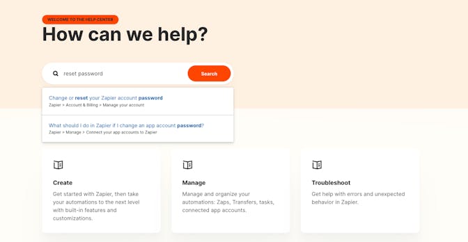
Search is a common way for finding content from folks who have an idea what they are looking for and want to quickly validate that you have the content.

Search is super powerful because organization matters very little. What matters more is that you have the content and are using terms within that content that the reader expects.
Table of Contents (In-Page Navigation)
Last, but certainly not least is a (tree-like) navigation that exists as part of an article page. It shows the hierarchy of content on the page at a quick glimpse, and enables you to jump directly to a section.

While there are many other methods for getting users to the content they seek, I've found that getting some combination of these five methods correct can leave developers feeling good about your site.


