Introducing Component Adapters into a Gatsby Project
Component adapters are a great way to separate logic from presentation in component-driven development projects. Here's how I've implemented the approach in Gatsby.
Much of my focus on recent projects has been in organizing components so my team can work efficiently. To aid in this effort, we've introduced the concept of adapters to separate logic from presentation.
This transition has enabled the front-end devs to work outside the context of the data source, helping them fly through creating and styling components. Then, later in a project, some weirdo like me — who actually enjoys working with the data — can wire up static components to the data source, effectively making them dynamic. By playing to our devs' strengths, we've been able to build better products faster.
In the more conceptual adapter article I used a generic example to emphasize my point. But, as I'm working mostly with Gatsby these days, I wanted to share what this approach looks like within a Gatsby project. In these examples, we'll be working with a <Calendar /> component.
Ready? Me too. Let's go ...
Staying Organized
The goal of our component is to retrieve all events from the data source, transform the data, and then present it on screen as a calendar.
Early in a project, while the back-end devs are working on the data structure, we want the front-end devs to be able to begin building out the UI. To make this happen, we will create a system in which both back- and front-end devs can work efficiently without stepping on the other's toes.
The first thing we're going to do is group our component files together in a directory. Let's put them in src/components/calendar. The structure will look like this:
src/
└── components/
    └── calendar/
        ├── adapter.js
        ├── component.js
        ├── fixtures.js
        └── index.js
If it seems like a lot, it is. We could put all the code we're going to work with in a single calendar.js file. This approach is in an effort to stay organized. (A real-world example likely involves even more files in the calendar directory!)
The approach I've taken to breaking up files in this way follows two primary paradigms:
- Single Responsibility Principle: Every file has one primary purpose to serve.
- Convention over Configuration: When building project after project, it makes much more sense to create an efficient process that takes a little time to learn than it does to provide more flexibility.
With that in mind, let's look at each of the files individually.
The Component
The component file is straightforward. It's probably just a simpler version of the component files you're used to working with.
Its goal is to focus entirely on the function and style of the rendered on screen. Assuming we're using some third-party library (calendars are hard) for the calendar (like this one), there's probably not much to it other than some configuration tweaks and a little custom styling.
The base of the component should look something like this:
src/components/calendar/component.js
import React from "react";
import PropTypes from "prop-types";
// Import other libraries

const Calendar = ({ events }) => {
  // Do component stuff
};

Calendar.propTypes = {
  events: PropTypes.arrayOf(
    PropTypes.shape({
      ends: PropTypes.string,
      starts: PropTypes.string.isRequired,
      title: PropTypes.string.isRequired,
      url: PropTypes.string.isRequired,
    })
  ),
};

Calendar.defaultProps = {
  events: [],
};

export default Calendar;
While this is just an example, what I'm demonstrating here is that we can configure our event object shape to match exactly what we are going to pass into the third-party library. This component shouldn't worry at all about data transformations. It should assume that's already been done and the properties it is accepting are ready to use.
The Fixtures
The fixtures file contains static (or fixed) data. It's often used for testing purposes (and should be here, too/), but we're going to use it for working quickly in development.
Before we know what the data source is and can work dynamically, we want to be able to build this component. So we use static data.
Assuming many of the components in the application can vary (i.e. they accept props), we'll setup our fixtures file to account for variation. (This is also useful when testing.)
Using that approach, a super simple version of the fixtures file could look like this:
src/components/calendar/fixtures.js
export default {
  simple_calendar: {
    events: [
      {
        title: "Bob's Birthday",
        starts: "2020-06-20T00:00:00Z",
        url: "/events/bobs-birthday",
      },
      {
        title: "Irresponsible Quarantine Party",
        starts: "2020-04-20T00:00:00Z",
        url: "/events/irresponsible-quarantine-party",
      },
    ],
  },
};
Now I have what I need to be able to render the component statically. All I have to do is use the fixture. That means we can implement or use the component elsewhere in the project like this:
import Calendar from "components/calendar/component";
import CalendarFixtures from "components/calendar/fixtures";

const calendar = <Calendar {...CalendarFixtures.simple_calendar} />;You'd likely have to update your import paths, but the point here is that it will just work. There is no data coming from the data source. We're mocking that with a fixture.
Also, the {...} syntax represents a spread operator. It's worth looking into if you are unfamiliar with the concept.
The Adapter
Ultimately, we know we want to pull data from a data source, which may not match the structure we're expecting in the component. That's where our adapter comes into play.
The adapter is responsible for retrieving and transforming the data. After transformation, it renders the calendar component. In other words, it's a data wrapper for the the main component.
I know I mentioned the single responsibility principle above and this deviates from that in retrieving and transforming data. If you really want to stick to it, you could create a separate transformer file that only focuses on mapping raw data fields to the component. (I'm working on a smart version of that but am not there yet, so I'm currently shoving both of those responsibilities into the component adapter.)
Let's assume that we have a GraphQL query we can run in our Gatsby project called allEvents that returns all the events. Except the properties don't quite match what we'd expect. Instead of starts and ends, we have starts_at and ends_at. So we can do something like this:
src/components/calendar/adapter.js
import React from "react";
import { useStaticQuery, graphql } from "gatsby";

import Calendar from "./component";

const CalendarAdapter = () => {
  const data = useStaticQuery(graphql`
    query {
      allEvents: {
        edges {
          node {
            title
            starts: starts_at
            ends: ends_at
            url
          }
        }
      }
    }
  `);

  return <Calendar events={data.allEvents.edges.map(({ node }) => node)} />;
};

CalendarAdapter.propTypes = {};

CalendarAdapter.defaultProps = {};

export default CalendarAdapter;
There really isn't much to this file. All it does is use a Gatsby static query to retrieve all the events, and then it passes them onto the calendar component.
We could now update our implementation to look like this:
import Calendar from "components/calendar/adapter";

const calendar = <Calendar />;
Boom! Now we're pulling data from the data source and rendering it on the page. Beautiful!
But, we're not done, because ...
The Index File
The problem with this approach, as it stands now, is that we would have to manually switch back and forth between adapters and static components, depending on our context.
If a front-end dev comes and picks up the project after the adapters are hooked up, now they have to work with (and worry about) the data source. That defeats our original purpose. Instead, we want a way to maintain a separation between component and adapter.
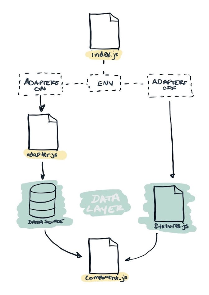
That's where the index file comes in. What we could do is use an environment variable to understand the outer context of our project, and then conditionally render the appropriate component. Like this:
src/components/calendar/index.js
import React from "react";

import Component from "./component";
import fixtures from "./fixtures";
import Adapter from "./adapter";

const DefaultExport =
  process.env.GATSBY_ADAPTERS === "on" ? (
    <Adapter />
  ) : (
    <Component {...fixtures.simple_calendar} />
  );

export default DefaultExport;
Notice that all we're doing is bringing in the contents of the other files, and then conditionally choosing our default export. If we have turned on our adapters, then we simply render the adapter, otherwise, we use the combination of the fixture and the component to render a static version of the component.
Now the implementation looks similar, but is much more powerful:
import Calendar from "components/calendar";

const calendar = <Calendar />;
(The only difference here is that we chomped /adapter off the end of the import statement.)
When it all comes together, the workflow looks like this:

Now you have a system on which you can separate logic from presentation in your Gatsby project!
Please take this and use however you'd like. And share back with me how you tweak your setup! It helps me get better, and it helps make the web better, too.


